

Tuesday, December 16, 2008

Gallo Nero- Color Scheme 2

Color scheme 2
Comfort: Green and blue
Relaxing: Brown
Using colors: Brown, blue and green

- To show that this restaurant is like the customer's home and relaxing, the colors, which are going to be used, are blue, brown and green because they show relaxation and comfort. Since comfort and warmth are the key points of this restaurant, using these three colors would show the key points of the company.


Thursday, December 11, 2008

Gallo Nero- Color Scheme 1

Color scheme 1
Warmth: Yellow. red and orange
Comfort: yellow
Fellowship: yellow, and pink
Using colors: yellow, orange, and red

- Since what this restaurant is representing is the warmth and comfort of the restaurant and their fellowship. The colors that are going to be used are yellow, orange, pink and red. These colors are used because they show warmth and comfort


Monday, December 8, 2008

Weekly Article (Semester 1)

5 blogs I have read:
http://charlie6330.blogspot.com/
http://DD-jack.blogspot.com/
http://tape-jessy3513.blogspot.com/
http://bk190.blogspot.com/
http://blog-on-blogger.blogspot.com/

Articles that I have chosen:

http://bk190.blogspot.com/
http://www.alistapart.com/articles/whitespace

From this article I have learned a lot about white space. I think it is interesting to see how white spaces change the look of the design. I have learned that white space can make a ‘good’ design to a ‘great’ design. And that white space gives luxury and flexibility on the design. From this article I learned that leaving white space out is not a bad thing but can be a good thing.

http://tape-jessy3513.blogspot.com/

For this blog, I found that the whole blog is interesting because instead of finding articles, Cindy found designs that interested her and explained how it is which was quite unique compared to other people’s blogs. I think it is a good idea to put a weekly design up on the blog.

http://charlie6330.blogspot.com/
http://www.wpdfd.com/issues/87/the_design_environment/

From this article I have learned that organization is an important part of design. Also I learned the fact that visual elements, color, typography, imagery and content are the factors which determine the organization of a certain design. If there is a messy and not environmentally friendly website or a webpage, then people just tend to stay away from that website which makes us learn that the environment or the organization of the website takes great part.

http://bk190.blogspot.com/
http://www.bluemoonwebdesign.com/art-lessons-5.asp

This article shows that keeping the design simple makes the design better. A simpler design is better to look at than a complex design. I have learned that fact and also I have learned that when you put an element into a design, you have to not think of the effect that the element has but think of what the overall effect would be if the element is put in. I think I have learned a lot from this specific article.

Web 2.0 Logos


Saturday, December 6, 2008

Web Site Design: Who Is Your Audience?

One of the first things that you need to decide, long before you begin your analysis, design and implementation, is who is your audience? With whom are you trying to communicate? You are obviously creating a web site for a reason, and hopefully you intended someone to view it. In fact, you should define your audience before you even get into any details about what the web site is to do - the "to do" will actually be made much more clear once you understand your audience.

There is the odd circumstance of someone creating a web site just for him, but this is a very rare exception. Usually there is some intention for someone else to view the material, read the articles or listen to the sounds.
So who is this group of people who you except to visit your web site? This is a far more important question that it appears on the surface, as it will define and guide you through just about every remaining phase of your web site implementation. The question of "who" will determine how you write, which graphics and sounds you include, what kind of HTML tags you use and what other technologies are needed.

It is critical to understand that you cannot communicate to everyone. For example, a web site that is aimed at five year olds will probably not be very useful to computer professionals (except, possibly, as an example of how to do it).

So sit back and think for a minute. It does not matter what kind of site you envision - you can determine your audience. Start with the subject material. Let's say you are creating a website about model railroads. That's your subject, model railroads. This is very general, but it will do for now.
Okay, now, are you communicating with beginners? Experienced railroaders? or are you attempting to explain the subject to someone who does not know anything about it? Perhaps you want to communicate with all of these groups - but are you also interested in writing to the critic of the hobby?

Let's take an intranet that I worked on a number of years ago. This was intended to explain how my staff was to perform their various system management procedures. It would include step-by-step instructions for each of the tasks that they performed on a day-to-day basis.
So who is my audience? My own staff members. Let's define them a little further. They are highly technical, well trained and know how to do their own jobs. By defining just this much, the nature of what needs to be written becomes more clear. Extreme detail is not necessary, for example. In addition, by knowing that they are, say, trained in Windows NT, I can specify that Windows NT commands do not need to be explained. It can be assumed, because I know my audience, that they know this information.
Another intranet which I have helped design is intended for use by store managers. By simple defining that information, I can determine exactly what information is needed by this group of people. I can also infer what data they do not need to have explain in detail - because they already know it. I can also expand the audience by saying "store captains and their direct reports". Now I might have to include more information, as the direct reports may need additional explanation.

If possible, it is a great idea to interview or survey some of your intended audience. I have done this on several occasions, and it has prevented many errors which may otherwise have crept into the final product. Remember your end user may not be the person who is paying for the project - it is the people with whom you are trying to communicate.

Things to note as you are defining your audience:

- Education - are you aiming for an audience of college graduates or school children or something in between. This is necessary to determine how you write your articles.

- Technical training - what kind of training and technical knowledge do you expect your end users to have. By knowing this information, you can make assumptions about their abilities.

- Medical conditions - does your intended audience have any medical conditions that you need to account for? For example, if you are writing to the blind, you may need to do extra work to be sure they can hear your site addition to (or instead of) being able to see it.

- Graphical orientation - is your audience better communicated with using graphics, text, sound, movies or a combination of the above? By knowing who they are, you can tailor your presentation towards them. For example, if I made a site tailored for my boss, I might include flowcharts, spreadsheets and diagrams. For my technical people, text descriptions might be more than adequate.

Once you know your audience, other things become obvious. For example, a common question is whether to code a site for just one browser or all browsers. When I created an intranet, we coded strictly for Internet Explorer V5 since everyone in the company used that browser. By knowing our audience we could define this early in the project. The same holds true for things like screen resolution, graphics formats (jpg, gif and png), load times (the intranet had a network so it was fast) and so on.
You audience also determines what kind of content you will include on your site. Thus, if your site is intended to be read by advanced webmasters, you probably don't want to include articles on how to load you site onto a free host. They should already have this information.

As you can see, by understanding your audience, you can answer many of the questions that come up during web site design. In fact, this understanding often makes the decisions become non-issues - they are obvious.

Summary of the Article:
The first thing you do when you design a web is that you have to figure out who your audience is because that changes the way you design your web. The audience determines graphics, how are you going to write, sounds, and what kind of HTML tags you use and the technology needed.

These are some things that depend on the audience when designing a web: Education (Are you aiming for an audience of college graduates or school children or something in between), technical training (what kind of training and technical knowledge do you expect your end users to have. By knowing this information, you can make assumptions about their abilities.
), medical conditions (does your intended audience have any medical conditions that you need to account for? For example, if you are writing to the blind, you may need to do extra work to be sure they can hear your site addition to (or instead of) being able to see it.), and graphical audience(is your audience better communicated with using graphics, text, sound, movies or a combination of the above? By knowing who they are, you can tailor your presentation towards them. For example, if I made a site tailored for my boss, I might include flowcharts, spreadsheets and diagrams. For my technical people, text descriptions might be more than adequate.).

Source from: http://www.edezines.com/article11.shtml
Written by: Richard Lowe

Tuesday, December 2, 2008

Practice Logo

I have used black, grey, brown and red for the shape of a chicken because those colors appear in a typical chicken. I have used the color black for the name of the company because black is the color which stands out in this particular poster. I have used the font Helvetica because this font is the font which is mostly used and also it is very good to read easily.

Thursday, November 27, 2008

Wednesday, November 26, 2008

Weekly Article: Writing Well for the Web

· Using Links - Don't let the reader know you're leading them

· Keep it Personalized - Who's writing your pages anyway?
· Good Navigation - You can't know where your readers are coming from.

I admit it, I'm biased. I was a writer with a book title to my name before I became a Web Developer. Then, when I joined the Web team, I was brought on as a Web Writer. I like to write, I like good writing, and writing is my passion. So, when I see Web pages that demonstrate that the author doesn't care about writing, I cringe.

There are many things that constitute good writing. They include correct spelling, good grammar, as well as interesting content. However, to write for the Web you have to be aware of how people read Web pages, as well as the nature of hypertext itself.

Using Links

Don't use: "click here"How do you handle links on your Web page? If you're like most people, you have the words click here sprinkled liberally through your pages. Now, you may be thinking (as does the Marketing Department where I work), "What does that matter? Jennifer is just being a style martinet again."

Yes, I admit that I can be inflexible when it comes to those two words in a Web page. These two words completely destroy the flow of any document. The only time I can condone using "click here" is if you are writing a Web page on how to use Web pages.

Do use title tags and "inter-paragraph" links
I have found that the best way to add in links to Web pages is to add them after you've written the text. You can then go in and highlight textual elements as links so your readers can get more information. When I do this, I try to use title tags in my HREF so that readers with title enabled browsers will know where they are going.

Keep it Personalized

We all have myriad chances to deal with automation in our lives these days. Why not let your readers know that there is a person behind the pages? Because my pages are on About.com they all have my photo on them, but I like to keep my articles friendly and easy to read. (I think the other reason I write so casually is because I have to write specs at work, and those are very dry and impersonal.)

When you create your pages, make sure that you have some way to contact you on the Web page. If you don't want to be listed on every mailing list in the country, then at least put your name so people can give you credit. Why did you spend so much time on your pages if you didn't want someone to read them and know that you wrote them?

Good Navigation

Elsewhere on this site, there are many pages that have information of interest to my readers. A lot of these pages include navigation at the top, bottom, or sides that says "Next", "Previous", "Back", "Top", and so on. However, if you came to that page from my page, you have no idea where those links are going to take you.

This is the beauty of the Web; you never know where a link will take you or how people will find your page next. Never assume that because you set up a beautiful table of contents that anyone but you will use it. Links of this nature make you the tour guide again. Your links should tell people where they are going, preferably as part of a sentence, but they shouldn't be reminded to use their mouse to get there.

Summary of the Article:

There are three major points that you need to know in order to write well for the web. First, it is important to not show the reader that you are leading them to someplace. When you put up a link, you should put “click here” this is because that ruins the flow of the whole piece. Also it is nice if you indicate the writer of the web page. Last of all, when you are putting links, you have to put what this site leads to.

Source from: http://webdesign.about.com/od/writing/a/aa061598.htm

Tuesday, November 25, 2008

Friday, November 21, 2008

Weekly Article: 35 Deadly Website Sins that will Kill Your Business

After reviewing thousands of web sites over the past couple of years for my Exceptional Sites Award, I have come to the conclusion that many business web sites are missing the boat.

For example; I've been working on some offline promotions and was searching for a simple targeted mailing list. I searched through about twenty sites and not one of those sites were, what I would consider, professional. Their standard blue links were enlarged to about a size 16 font, busy backgrounds, flashing images and very unorganized.
Did I purchase a mailing list from any of those sites? Absolutely not. Why? The way I see it, if those companies don't take pride in their web sites, chances are, and they won't take pride in their products either. Large linked text and flashing graphics won't make sales.

Your web site is a direct reflection of you and your business. The appearance of your site is the most important factor in determining your sites value. In other words, if your site doesn't look professional or pleasing to the eyes at first glance, its perceived value and the value of your products and services will be low.

On the other hand, you may have a great web site, well designed and a quality product or service, but if it takes too long to load, the value will still be perceived as low. Why? Because your potential customer won't wait. Ultimately costing you business.
Another consideration of great importance is your content. Not just links, but content with value. When someone is surfing the net and they visit your web site, they're visiting for a reason. Your site has something they want. Whether it is your product, service or information, that's why they're there. If they don't find what they're looking for, they move on to the next site and so on. If you want your visitors to stay at your site, provide the quality content they're looking for in a nicely organized fashion. Give them a reason to want to explore your site and to continue to visit your site in the future.

After receiving many questions, in regard to site design, from my visitors who weren't selected to receive an award, I have devised a list of what I refer to as "35 Deadly Web Site Sins".
- Poor load time - Poor overall appearance - Spelling/Grammar - No contact information - Poor content - Poor navigation - Broken links and graphics - Poor browser compatibility - Large slow loading graphics - Too many graphics - Pages scrolling to oblivion - Multiple use of animated graphics - Animated bullets - Too many graphic and/or line dividers - Busy, distracting backgrounds - Multiple banners and buttons - Poor use of frames - Large fonts - Pop up messages - Over use of java - Poor use of tables - Poor organization - Different backgrounds on each page - Over powering music set to auto play - Confusing - Too much advertising - Large Welcome banners - Multiple colored text - Text difficult to read - No Meta tags - Multiple use of different fonts - Under construction signs - Scrolling text in the status bar - Large scrolling text across the page - Poor use of mouse over effects
Take some time to really look at your site. Compare it to sites that you feel look professional. Time your sites load time. Your customers won't wait. Their time is valuable.
The simple, well-designed sites make the sales. If your sales aren't what you had hoped, take some time to seriously evaluate your site and make some changes before spending your time and money on advertising and marketing. You may be pleasantly surprised

Summary of the Article:
The writer of this article Shelley Lowery stated that the website is the direct reflection of the person who makes the business and the business itself. When you design a website, you have to consider not only the design itself but other things too in order to make your business and you yourself professional. There are 35 deadly sins that you shouldn’t do when creating a website and they are
1. Poor load time 2. Poor overall appearance 3. Spelling/Grammar
4. No contact information 5. Poor content 6. Poor navigation
7. Broken links and graphics 8. Poor browser compatibility
9. Large slow loading graphics 10. Too many graphics 11. Pages scrolling to oblivion
12. Multiple uses of animated graphics 13. Animated bullets
14. Too many graphic and/or line dividers 15. Busy, distracting backgrounds
16. Multiple banners and buttons 17. Poor use of frames 18.Large fonts
19. Pop up messages 20. Over use of java 21. Poor use of tables
22. Poor organization 23. Different backgrounds on each page
24. Over powering music set to auto play 25. Confusing 26.Too much advertising
27. Large Welcome banners 28.Multiple colored text 29. Text difficult to read
30. No Meta tags 31. Multiple uses of different fonts 32. Under construction signs
33. Scrolling text in the status bar 34. Large scrolling text across the page
35. Poor use of mouse over effects

Source from: http://www.web-source.net/website_sins.htm

Thursday, November 20, 2008

Color Basics

- Color is determined by its name, how pure or desaturated it is, and its value or lightness.

- Chroma: How pure a hue is in relation to gray 


- Saturation: The degree of purity of a hue. 


- Intensity: The brightness or dullness of a hue. One may lower the intensity by adding white or black. 


- Luminance / Value: A measure of the amount of light reflected from a hue. Those hues with a high content of white have a higher luminance or value.

- Shade and tint: are terms that refer to a variation of a hue.

- Shade: A hue produced by the addition of black. 
Tint: A hue produced by the addition of white.

- Tint: A hue produced by the addition of white

- There are color systems such as subtractive color and addictive color. Subtractive color is when you mix colors using paint. Addictive color is when as more color is added, the result is lighter and tends to white.
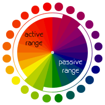
- The warmer colors are called the active range and the cooler colors are called the passive range.

- Vibrating Boundaries may occur when opposing colors are brought together.

- Monochromatic Relationship: Colors that are shade or tint variations of the same hue.

- Complementary Relationship: Those colors across from each other on a color wheel.

- Split-Complementary Relationship: One hue plus two others equally spaced from its complement.

- Double-Complementary Relationship: Two complementary color sets; the distance between selected complementary pairs will effect the overall contrast of the final composition.

- Analogous Relationship: Those colors located adjacent to each other on a color wheel.

- Triad Relationship: Three hues equally positioned on a color wheel.

The Meaning of Colors

Red: Energy, strength, passion, eroticism, cheerfulness, courage, element of fire, career goals, fast action, lust, desire, blood, vibrancy, driving forces, risk, fame, love, survival, war, revolution, danger, aggression, strength, power, determination

Pink: Romance, love, friendship, femininity, truth, passivity, good will, emotional healing, peace, calming, affection, emotional maturity, caring, nurturing, sweet tasting, sweet smelling, ethereal, delicacy.

Orange: warmth, energy, balance, enthusiasm, vibrancy, vitality, expansiveness, flamboyance, excitement, business goals, property deals, ambition, career, goals, general success, justice, legal matters, selling, action, attention-grabbing, the sun, friendly, inviting, intense, joy, strength

Blue: good fortune, communication, wisdom, protection, spiritual inspiration, calmness, reassurance, gentleness, fluidity, water, sea, creativity, peace, calming, higher thoughts, mystery, sky, formality, travel, devotion, progress, quiet wisdom, freedom.

Green: earth mother, physical healing, monetary success, abundance, fertility, tree & plant magic, growth, food, hope, personal goals, resurrection, renewal, youth, stability, endurance, freshness, nature, environment, tranquil, refreshing, quiet, hope, immortality, health, healing, good luck

Yellow: Sun, intelligence, light, accelerated learning, memory, logical imagination, social energy, cooperation, organization, breaking mental blocks, sunshine, joy, happiness, intellect, energy, cheerfulness, optimism, purity, enthusiasm, warmth, honor, loyalty, mental force, clarity, perception

Gold: wealth, god, winning, safety, masculine power, happiness, playful humor, prestige, wisdom, love of spirit, meaning, purpose, awe, spiritual love, quests of the heart, desire for power, mystic powers, higher mathematics, sciences, attainment, concentration

White: spirituality, goddess, peace, higher self, purity, virginity, reverence, simplicity, cleanliness, humility, precision, innocence, youth, birth, winter, snow, good, sterility, cold, clinical, sterility, clarity, perfection

Purple: influence, third eye, psychic ability, spiritual power, self assurance, hidden knowledge, dignity, high aspirations, royalty, spirituality, nobility, ceremony, mystery, transformation, wisdom, enlightenment, sophistication, cruelty, arrogance, intuition, dreams, unconscious, invisible, telepathy, empathy, imagination, deja vu, universal spirit, spiritual connection, deeper truth, nobility, wealth, extravagance

Monday, November 17, 2008

Weekly Article: Color Symbolism

When is the last time you saw a Web site in black and white?

Color is vital to the repertoir of your average Web designer, and yet many designers don't realize that the colors they choose may be having more of an effect than they realize. Colors are an element of design that people react to on a visceral level. Often, they don't realize they are reacting to it. For example, in the U.S. many hospitals dress their nurses in light blues and pale pinks. This is because these are calming, soothing colors, and upset patients relax a little in their presence. Once you understand your audience make up you can create a color scheme that suits them.
When choosing the colors for your site, you need to first (as always) think of your audience. Is it a global audience? Is it primarily Western? Eastern? Are they older? Younger? Male? Female? All of these things and more can affect the color choices for your site.

Cultural Differences

Colors obtain symbolism through cultural references in the culture you grew up in. Depending upon the culture, colors can have very different meanings and actually cause problems for your site. For example, in the East, white is the color of funerals while in the West white is the color of Weddings. If you were to design a Wedding site intended for an Asian audience and you used a lot of whites, you could be disturbing the people you're trying to reach.

Age Differences

Young children tend to prefer brighter, more solid colors, while adults tend to prefer more subdued colors. If you're writing to an audience of children and you're using muted pastels and shades of grey, their parents might like it, but the kids will be long gone before the page finishes loading.

Class Differences

Marketing research in the United States has shown that working class people tend to prefer colors that you can name: like blue, red, green, etc. While more highly educated classes tend to prefer colors that are more obscure: like taupe, azure, mauve, etc. This is why Walmart does their store logo in bright red.

Gender Differences

In many cultures, men tend to prefer cooler colors (blues and greens) while women tend to prefer warmer colors (reds and oranges). Western men are also more likely to be color blind and so unable to see some of the differences in color on Web pages.

Trends

Colors, like everything else in design, go through ins and outs in popularity. Black Web pages were all the rage a few years ago, and now you hardly see it at all (but it will surely come back into style as I write this). Colors also tend towards seasonality, in other words, the designs reflect the season they were built in: winter blacks, whites, and greys; spring greens and bright colors; summer yellows; fall browns and golds.

Summary of the Article:

Color is very important in everything but it is particularly more important when doing design. Many people don’t realize that color gives great impact to the people who look at your design. When designing anything, you should see who your audience is because that depends on what color you have to use. For example, when you are dealing with age differences, children like more bright colors and adults like more subdued colors. Also for class and gender differences, working class people like colors that you can name and richer class don’t. Also mostly, men like cooler colors and women prefer warmer colors. So, these examples show that color can impact how the person looks at your design so when you design, it might be helpful if you know who your designing to.

Source from: http://webdesign.about.com/od/color/a/aa072604.htm

Thursday, November 13, 2008

Rationale

I did my poster on El Lissitzky; a graphic designer from Russia. He learned under Malevich who focused on constructivism and suprematism. El Lissitzky was greatly influenced by constructivism and focused on constructivism. He also greatly influences other movements such as Bauhaus. The style constructivism is when a person uses geometric shapes and primary colors to express what the person is trying to say also most of the text is right angled from each other which is also related to geometry. Also the borders of the text are bordered around with the color the text is. So for example if there is a word ‘Constructivism’ in red, the border of the text is bordered around with red. Also, the style constructivism is when a person makes the work simple and there is less use of space. The work that I referred to when I made my poster is called “For the Voice” and it was designed by El Lissitzky in 1923. The design overall is simple and there are geometric shapes involved such as a circle, two long rectangles and a square. There is very little text. There is very less use of space. I first put a red circle like in the piece “For the Voice” and then I took a picture of El Lissitzky and blended the picture behind the circle and the purpose of this was to show who I am doing the poster on. After that I took a font which fit this poster and I started to put key words in related to El Lissitzky and constructivism which Lissitzky mostly focused on. I put key words such as ‘text right angled’, ‘El Lissitzky’, ‘primary colors’, ‘geometric shapes’ and ‘graphic designer’ etc. I then arranged the text so that it fit El Lissitzky’s style of designing. In addition, I added geometric shapes such as rectangles and squares which El Lissitzky also did in his piece “For the Voice”. I then organized the size of the text and the shapes to use less space. After, like El Lissitzky did I bordered the text with primary colors. He used modernism font so on the bottom of the poster I used a modernism font.

Tuesday, October 28, 2008

Weekly Article: Getting Attention With Your Site Design

When designing a Web page, there are many ways to attract attention to important events or items. The most common way is to change the font size of the headline. For example, during the U.S. war in Iraq, CNN.com changed their banner headline from font-size: 20px to font-size: 48px - more than doubling it.

You can see that in the two screen shots of CNN - the first is from December 2002, and the largest headline reads: "Iraq promises report Dec. 7". This is written in 20px type right below the photo. The second screen shot is from CNN in March 2003. The banner headline reads "CLASHES INTENSIFY". This is written in 48px type at the top of the page. Even the second headline (which does not completely show in the screen shot), is in font-size: 28px, another 8px larger than their standard headline from December.

Using Typography to Get Attention

Using changes in font sizes to get attention is nothing new. But before you go out and make your headlines 48px or larger, you need to follow a few simple rules:

1. Is this really that important?If you're announcing a 30% off shoe sale, it might be important to some people but making the font unbearably huge will just turn most people off.
2. What's the standard font size on your page?If you type everything at 20pt, then creating a 30pt headline will not look that much different. But a 16pt headline next to 8pt text might look huge.
3. Do you have standards for what font size to use?You should decide ahead of time what types of events will trigger an increase in headline size. Once you have a plan, then even if your marketing director comes in begging to announce his shoe sale at 56pt type, you will have a standard size for that level of event.

But changing the font size is not the only way to get attention. You can also
play with the font:

· Family: If you have a sans-serif font, switch to a serif font for emphasis.
· Color: Reds are a good color to attract attention.
· Style or weight: Making text bold or italicized will make it stand out.

Other Ways to Get Attention

Changing the font size or color is not the only way to change your Web site to get attention.

· Images: Images and graphics are always attention-getters. The aphorism "a picture says a thousand words" is true because people are visual, and using a picture to enhance or emphasize what you want to say will do more than just words alone. Google uses pictures to emphasize various holidays and other events.
· Layout: An exciting way to attract attention to an event is to completely change your layout. After the September 11th attacks, CNN removed nearly all of their normal navigation to give more room for their coverage of the events. Amazon thanked its customers for their loyalty by replacing their front page with a letter from the president.
· Animation: Animation where normally you have flat images will attract attention. Many Web designers use this in splash pages to show off their skills and make their site more dynamic.

Use with Care
It is easy to go overboard with these techniques. If every line of your site is bold or red or blinking then nothing will stand out. And if you announce your 30% off shoe sale at the same intensity as announcing a war, your customers will quickly learn to ignore your designs, and eventually go to a more even-handed Web site.

Summary of how to draw attention:
Use typography; change the fonts if there is a part which you want to emphasize. But before you do that, you have to think if this information is really the part you want to emphasize and the standard font of your webpage. Not only does the size of fonts draws attention but the type of font (serif, sans serif, modern and script etc). Also the color can draw reader’s attention; red is a very good color for attention. In addition, bolding and italics also help. Other then these main methods, inserting images, completely changing the layout and putting animation in would help attract the reader’s attention.

Source from: http://webdesign.about.com/cs/webdesing/a/aa032403a.htm

Photoshop- making the subject stand out

Before working on photoshop
After working on photoshop

Steps to make the subject stand out:
1. You duplicate the layer.
2. Then with the duplicated layer you go to filter -> blur -> Gaussian blur
3. After that you choose how much you want the background to be blur
4. Then you select the subject with the 'quick selection tool'
5. You press backspace and then you get a picture in which the subject stands out

Thursday, October 2, 2008

Notes on Helvetica

Helvetica

Helvetica: Brand names, signs, logo

The name of the company and the logo of the company are just done in Helvetica.

Helvetica is simple, neutral, it is easy of the eye, it is sans serif, the letter has uniformity to them, and there is equal spacing.

Spacing is as and more important than the font itself. Helvetica has perfect spacing.

Helvetica is modernist font, which represents modernist ideas. However, it is sans serif it is easy on the eye.

The problem of Helvetica is that it is overused.

It is ubiquitous- it is everywhere.

Helvetica is considered ‘not cool’ because it is too simple, too perfect, and too boring because it is ubiquitous.

It is corporate and artists dislike it. It is institutional.

Modern is becoming retro.

Rather than being an authoritarian, oppressive, bureaucratese, instead accessible, transparent, and accountable.

Horizontal slicing of terminals - characteristic of Helvetica

Helvetica example: Jeep, Sears, BMW, Toyota, aprilia, target, Tupperware, Nestle, Verizon, conEdison, Lufthansa, Energizer, Oral B, The North face etc.

This shows again that Helvetica is ubiquitous

A real typeface needs rhythm and contrast. Helvetica doesn’t have rhythm or contrast.

Helvetica needs lots of space and all the letters shouldn’t look the same.

Typeface is a part of branding. Branding is the projecting of quality.

Creating a font

Use h first then o and then p. h n u because you have lots of information between them.

Then you start building on go to words.

Counter cultural movement of the 1960s is what overwhelms the modernist movement.

Modernism: (objectivist)

Functionalism

Utilitarianism

Clean and simple

Post Modernism: (subjectivist)

Freeform

Chaotic

Complicated

Michael C Place: new modernist. Has a view that the context can make the piece speak in a different way though the font is the same.

Wednesday, October 1, 2008

Tuesday, September 30, 2008

Weekly Article: Shape - Basic Elements of Design

What are Shapes in Design:
Shapes are a basic element of design. They are made up of closed contours and three dimensional objects placed in the design. Shapes are used to convey meaning and organize information. Shapes can be 2-dimensional or 3-dimensional.
There are three basic types of shapes:
· geometric shapes
· natural shapes
· abstract shapes
Use of Shapes in Design:
Shapes in Web design can be used in many ways:
· add interest to a design
· sustain interest
· organize or separate elements
· direct the eye through the design
Geometric Shapes:
Geometric shapes are what most people think of when they think of shapes. Most geometric shapes on Web pages are created through layout and CSS. Some common geometric shapes you see on Web pages are:
· squares and rectangles
· circles
· triangles
· diamonds
Natural Shapes:
Natural shapes are shapes that are found in nature, but they are also shapes of man-made items. Most natural shapes in Web pages are created with images. Some examples of natural shapes are:
· leaves
· puddles
Abstract Shapes:
Abstract shapes are those that have a recognizable form but are not "real" in the same way that natural shapes are. For example, a stick-figure drawing of a dog is an abstract dog shape, but another dog in a photo is a natural shape. Abstract shapes in Web designs are usually added through images. Some examples of abstract shapes are:
· alphabet glyphs
· icons
· symbols

Summary of shapes in design:
Shapes are used to organize information and express your ideas across efficiently. Shapes can be either 2 dimensional or 3 dimensional. There are many uses of shape in design and they can be things such as: gaining attention, organize elements as said and to direct the eye through design. Shapes can be mainly divided into three man categories: geometric shapes, natural shapes, and abstract shapes. Geometric shapes are shapes that we normally think of such as circles and triangles. Natural shapes are things that are found outside commonly such as leaves, stones etc. Last of all abstract shapes are elements such as icons, and symbols.

Source from: http://webdesign.about.com/od/webdesingbasics/p/aashape.htm

Friday, September 26, 2008

Weekly Article: Color Harmony

Using Color Wheels and Color Theory to Design Harmonious Pages

Once you understand the basics of color theory, you can start learning how to combine those colors into a harmonious whole. There are certain colors that look good together, while other colors look so painful you have to click away before they burn your eyes. And while you might recognize these combinations when you see them, there is a theory based on the color wheel as to which colors will look nicest together.

Analogous Colors

These are the colors that sit next to each other on the color wheel. For example: green, yellow-green, and yellow; or red, red-orange, and orange. Play with the hues and saturation of analogous colors to create a harmonious color scheme.

Complementary Colors

Complementary colors are those colors that are opposite one another on the color wheel. By using colors that are opposite one another, you create color schemes that have high contrast and so are brighter and more vivid. Some contrasting colors are: red and green or blue and orange.

Color Triads

By placing an equilateral triangle on the color wheel, you can create color schemes that have a lot of life to them. The most basic color triad is the three primary colors: red, yellow, and blue. But others are: green, purple and orange, or yellow-orange, blue-green, and red-purple.

Still Having Trouble?

When looking for color schemes the first place I start is nature. The color schemes found in nature are typically harmonious to our eyes. This can be the case even if the colors don't "go together" according to color theory.

Summary of Color Harmony

Color is very important when it comes to designing a page. If you can put the colors nicely so that it is comfortable for the reader, the page would look much more effective. Analogous colors are colors that sit next to each other on the color table. These colors are used to form a harmonious color design. Complementary colors are colors which are opposite one another on the color table. This gives contrasts and makes the page look brighter. You can also put colors in a different way. By placing an equilateral triangle in the color table, you will get three colors. Those colors could be used to design your page. Nature is a good color scheme to have.

Source from: http://webdesign.about.com/cs/color/a/aacolorharmony.htm

Examples of the 6 types of fonts

There were 6 types of fonts mentioned and they were:
  • Old style
Old style: old styles always have serifs. Also the old styles have something called stress. This is when the thickness of the line goes from thin to thick and you can see it in curved strokes. Some examples can be Goudy, Palatino, Times, Baskerville, and Garamond.

  • Modern
Modern: modern typefaces have serifs, but the serifs are now horizontal instead of slanted, and the serifs are very thin. Moderns tend to have a cold look and the stress is vertical. Some examples of modern fonts can be Bodoni, Times Bold, Onyx, Fenice, Ultra, and Walbaum.
  • Slab serif
Slab serif: many slab serifs have a thin/thick contrast and are readable easily. These fonts are used in children’s books because they look clean. Some examples are Clarendon, Memphis, Memphis Extra Bold, and New Century Schoolbook.

  • Sans serif
Sans serif: this font is fro creating eye-catching pages and there are no visible thin/thick transitions in the strokes. Some examples of sans serif are Antique Olive, Helvetica, Avant Garde, Formata, Folio, Franklin Gothic, Futura, Condensed, and Syntax.

  • Script
Script: scripts can be good when they are large and some examples of script is Arid, Shelly Volante, Legacy, Cascade, Linescript, and Zapf Chancery

  • Decorative
Decorative: these fonts are easy to indentify but their powerful use is limited. Some examples can be Party, Potrzebie, Improv, Pious Henry, Juniper, Juice, Fajita and Scarlett.

Thursday, September 25, 2008

Chapter 9: Categories of Type

There are mainly six groups to divide the font and they are:

  •        Old style
  •        Modern
  •        Slab serif
  •        Sans serif
  •        Script
  •        Decorative

Old style: old styles always have serifs. Also the old styles have something called stress. This is when the thickness of the line goes from thin to thick and you can see it in curved strokes. Some examples can be Goudy, Palatino, Times, Baskerville, and Garamond.

Modern: modern typefaces have serifs, but the serifs are now horizontal instead of slanted, and the serifs are very thin. Moderns tend to have a cold look and the stress is vertical. Some examples of modern fonts can be Bodoni, Times Bold, Onyx, Fenice, Ultra, and Walbaum.

Slab serif: many slab serifs have a thin/thick contrast and are readable easily. These fonts are used in children’s books because they look clean. Some examples are Clarendon, Memphis, Memphis Extra Bold, and New Century Schoolbook.

Sans serif: this font is fro creating eye-catching pages and there are no visible thin/thick transitions in the strokes. Some examples of sans serif are Antique Olive, Helvetica, Avant Garde, Formata, Folio, Franklin Gothic, Futura, Condensed, and Syntax.

Script: scripts can be good when they are large and some examples of script is Arid, Shelly Volante, Legacy, Cascade, Linescript, and Zapf Chancery

Decorative: these fonts are easy to indentify but their powerful use is limited. Some examples can be Party, Potrzebie, Improv, Pious Henry, Juniper, Juice, Fajita and Scarlett. 

Wednesday, September 24, 2008

Chapter 8: Type

A concordant relationship is when you use one type family throughout the whole page. This is in terms of style, size, and weight. This can look harmonized and formal but it could get boring for the reader as the reader keeps reading.

A conflicting relationship is when you combine similar typefaces. This can be distracting for the reader.

A contrasting relationship is when you combine different typefaces together. This can make the contrasts emphasized and also this can draw the reader’s attention easily.

Concord is a useful concept however a conflict should be avoided. 

Wednesday, September 17, 2008

Poster changed after Review


I changed the font color because it shows contrast. This makes the writing more legible and also I took the dollar picture off because it didn't show alignment and it was just in the way. Though I only have one picture This looks more aligned and unified.

Chapter Six: Review

- Don't be afraid of font changing, blank spaces etc.
Proximity: Separate the elements that are not related to each other. This helps the reader to understand your point quickly.
Alignment: To keep the page unified, align the elements.  
Contrast: Contrast can be used by lines, colors, spatial relationships, directions etc. Contrast is good because it attracts readers attention easily.


Tuesday, September 16, 2008

Weekly Article: What is Emphasis in Design

What is Emphasis in Design:

Emphasis in design provides the focal point for the piece. It is a way of making the element that is most important stand out in the design. Emphasis is sometimes called dominance.

Use of Emphasis in Design:

One of the biggest mistakes designers can make is trying to make everything in the design stand out. When everything has equal emphasis at best it can make the piece appear busy, and at worst the design will be boring and unappealing.
Instead, focus on creating a visual hierarchy in your designs. If you've worked to create a semantic flow to your HTML markup, that will be easier. Because your Web page will already have a hierarchy, all your design needs to do is put the emphasis on the correct elements - such as the H1 element for the most emphasis and so on.

How to Include Emphasis in Web Designs:

Emphasis in Web design can be implemented in many ways:
· Using semantic markup will provide some emphasis, even without any styles.
· Change the size of fonts or images to emphasize or de-emphasize them in the design.
· Using contrasting colors can provide emphasis.

Summary of this article:

Emphasis is when you make some element on your page stand out. This is to show that the element which stands out is the key point of this page. Emphasis can be also called dominance. Emphasis is used in design because the page would be very boring and not attracting if there isn’t any change through out the page. Emphasis can be used by color, and size of fonts or images etc.

Source from: http://webdesign.about.com/od/webdesignbasics/p/aaemphasis.htm

Poster changed after Contrast


I have changed the background color so it is contrasting with the rest of the information and the picture (especially the logo). So I changed the color which is one element to use contrast in a webpage. This made the poster a bit more bright, it made the poster look a bit more interesting. I think this looks not boring compared to the white background poster.

Chapter Five: Contrast

     Contrast must be strong and effective and it is to make the reader interested. If two ideas on one page are different you should make it completely different. You can make contraction with color, font and texture. Contrast is good because our human eyes like contrasting images. There are basically two purposes of putting contrast into a page. The first reason is organization and the second reason is to draw the reader’s attention. Not only there are font, color and texture but also there are shapes, sizes, space etc. You should avoid making a small difference between two different ideas. If you are going to use contrast, then make the two really different.

Thursday, September 11, 2008

Weekly Article: What is Balance in Design

What is Balance in Design:
Balance in design is the distribution of elements across the design. Balance is a visual interpretation of gravity in the design. Large, dense elements appear to be heavier while smaller elements appear to be lighter. You can balance designs in three ways:
· symmetrical balance
· asymmetrical balance
· discordant or off-balance
Use of Balance in Design: Balance in Web design is found in the layout. The position of elements on the page determines how balanced the page appears. One big challenge with achieving visual balance in Web design is the fold. You may design a layout that is perfectly balanced in the initial view, but when the reader scrolls the page, it can come out of balance.
How to Include Balance in Web Designs: The most common way to incorporate balance into Web designs is in the layout. But you can also use the float style property to position elements and balance them across the page. A very common way to balance a layout symmetrically is to center the text or other elements on the page. Most Web pages are built on a grid system, and this creates a form of balance for the page right away. Customers can see the grid, even if there aren't any visible lines. And Web pages are well suited to grid designs because of the square nature of Web shapes.
Symmetrical Balance: Symmetrical balance is achieved by placing elements in a very even fashion in the design. If you have a large, heavy element on the right side, you'll have a matching heavy element on the left. Centering is the easiest way to get a symmetrically balanced page. But be careful, as it can be difficult to create a centered design that doesn't look flat or boring. If you want a symmetrically balanced design, it's better to create the balance with different elements - such as an image on the left and a large block of heavier text to the right of it.
Asymmetrical Balance: Asymmetrically balanced pages can be more challenging to design - as they don't have elements matched across the centerline of the design. For example, you might have a large element placed very close to the centerline of the design. To balance it asymmetrically, you might have a small element farther away from the centerline. If you think of your design as being on a teeter-totter or seesaw, a lighter element can balance a heavier one by being further away from the center of gravity. You can also use color or texture to balance an asymmetrical design.
Discordant or Off-Balance: Sometimes the purpose of the design makes an off-balance or discordant design work well. Designs that are off-balance suggest motion and action. They make people uncomfortable or uneasy. If the content of your design is also intended to be uncomfortable or make people think, a discordantly balanced design can work well.

Summary of this article:
One of the basic principles in designing is balance. Balance in design means to distribute the information so that it is comfortable for the reader to read and it is visually affecting the reader. Layout is the common way in which you balance a web page. There are three types in balance and they are symmetrical balance, asymmetrical balance and discordant or off- balance. First of all, symmetrical balance means when you put a small image on one side, you should put a text which doesn’t have much information in on the other side to equally balance both sides out. Also the information can be in the center but it could be boring so you have to be careful about that. This is the commonly used one. Asymmetrical balance is when if you put a big looking picture on one side close to the edge, you should put a small text right next to the center line on the other side. You can also use color to balance an asymmetrical design. The last one is off-balance and it is to make the page off-balanced on purpose to make the reader uncomfortable reading it. When you are trying to write something which is uncomfortable then off-balance is good for that.

Source from: http://webdesign.about.com/od/webdesignbasics/p/aabalance.htm

What I need for a Company

- Logos

- Banners

- Stationary

- Cards

- Front desk Piece

- Notes

- Fax sheets

- Memos

Poster changed after Repetition

The poster changed a lot after reading the chapter on repetition in terms of font of main text, font of headings, and lines. Before reading the chapter, the two text boxes had a different font. But after reading it, I have made the two the same to make it unified. Also I changed the font of the headings so that it is different to the text. I did this to make the headings look clear. I made the size of the font same for the information and I made the main heading the biggest and the sub-headings the same. Also I put two lines in yellow so it matches with the McDonald logo.

Wednesday, September 10, 2008

Chapter Four: Repetition

      Repetition is when you repeat a design throughout the page to make the page look cohesive and unified. Some elements which you can repeat font, format, line, color and relationships etc. If you have bolded the heading then you could catch the reader’s attention more if you bold the other sub- headings.  Also for the font; even though you don’t make the size same, if you make the type of writing the same, it make the article cohesive. To summarize, repetition is used to make the writing cohesive and also to make the reader interested about it. In repetition, you have to beware of contrast because it might make the reader confused. They might not know what is the main point of the writing. 

Poster changed after Alignment


After reading the article on alignment, I have changed the size of the picture of the burger because the burger is not the main picture but the McDonald logo is the main picture because McDonald is advertising this event. Also I have increased the size of the logo to emphasize that this is the main picture. I have read the alignment article and changed the poster so that the picture and the text is in line with each other so it looks very organized. Also with the text, first I had both of them centered which made it look untidy and boring so I pushed the text to the left side so it looks tidier. Also since all the information are aligned on the left side, I moved the heading to the left side so it looks more organized.

Tuesday, September 9, 2008

Chapter Three: Alignment

      The third chapter is called alignment and it says that there shouldn’t be anything put on the page randomly without any reason. Also the page should be neat and tidy so the reader doesn’t get confused. It said in the book that people often just put the information in the center but it could be better to put it on either side. You can center the writing but try to be dramatic with the font and don’t use the same font throughout the whole page. Don’t try to spread things out but make it neat and tidy; to put things in order. You have to find strong line and use it. For example if the head lines are placed left, then all the other writings should be put on the left side because this shows strong alignment. When you are designing a page, you have to unify the information and organize it.

Thursday, September 4, 2008

Poster changed after Proximity


In this picture I changed the location of the images and the writings to make it look easier to understand. I put the one dollar with the one dollar event together because they relate to each other. Also I tied the plus one and the burger image together because it is closely related to the writing which is beneath it. On the original poster I tried to fill up all the space there is but now making the related topics tied up looks more simpler. I also put the logo on the top to represent from where this ad is from. In the original poster the logo was on the bottom which is not so good. I changed the 28 picture to a writing saying 28th anniversary events because the readers might not know what the 28 means.

Chapter Two: Proximity

     Chapter two talks about proximity and the author is trying to say that when you are writing a newspaper, ad or anything else, it should be organized so the readers can understand the intention of this ad or newspaper. Putting things which are similar together is good for the reader to know what the writing is about in one glance. When the items are not related to each other, then you can have more than one space in between the two to differentiate them. The font of the ad or the newspaper shouldn't always be the same. If the font is the same and the writing is normal, then no one can understand what the main topic is about and what the information is. So, bolding the text and writing in different font is also another way to draw the readers attention and make the reader comfortable when reading the text. In terms of space, the purpose of the writing is not to fill the page up by to transfer the information efficiently. So, it is important to organize the text and not to fill up the page with the text. There are somethings to avoid when writing an ad or newspaper. The things to avoid is to not put many different topics in one page and not to have too many gaps and make the reader confused. 

Chapter One

     Chapter one is basically introducing the four types of basic principles proximity, alignment, repetition and contrast. In the first chapter the author said that once you name something, you get to see the object you have named which you haven't noticed before. For example, he gave an example of the Joshua Tree.

Wednesday, September 3, 2008

Tuesday, September 2, 2008

What is Graphic Design? Why is it so Important?

1. How would you define graphic design or Design? When did it start?
Graphic design is methods used by people to visually represent ideas and messages to others efficiently. Or it could be making something which represents a company. For example, graphic designs include magazines, logos and advertisements. Graphic design is not only the product which is produced but also the process of designing.
2. How would you define Technology?
Technology is a field which deals with making our life’s easier by creating new products. Technology always has to fit the principle form follows function. This is because that is why technology is there to make things easier which means the product must fit the purpose.
3. What would you say is the relationship between Design and Technology?How have they evolved together over time? Are they one and the same?
The relationship between design and technology is that they are both needed for each other. For example to design better you have to have good technology so that it is more comfortable to design. Also technology has to be designed so that it fits the function. Technology and design are not the same but they are just a catalyst for each other.
4. How has your perception of design changed after reading those articles?
I didn’t know anything about design or technology but know I understood that technology and design are closely related and mostly in design form follows function is applied a lot.