Showing posts with label Foundations. Show all posts

Thursday, January 15, 2009

Picture Position

- Rule of thirds:

Divide the page into 9 and the intersection between the lines or near the intersection of the lines is where you put your main subject.

- Positions of strength and weakness

The left side is giving a stronger impact to the audience compared to the right side because people tend to read from left side to the right side. 

Monday, December 8, 2008

Tuesday, November 25, 2008

Thursday, November 20, 2008

Color Basics

- Color is determined by its name, how pure or desaturated it is, and its value or lightness.

- Chroma: How pure a hue is in relation to gray 


- Saturation: The degree of purity of a hue. 


- Intensity: The brightness or dullness of a hue. One may lower the intensity by adding white or black. 


- Luminance / Value: A measure of the amount of light reflected from a hue. Those hues with a high content of white have a higher luminance or value.

- Shade and tint: are terms that refer to a variation of a hue.

- Shade: A hue produced by the addition of black. 
Tint: A hue produced by the addition of white.

- Tint: A hue produced by the addition of white

- There are color systems such as subtractive color and addictive color. Subtractive color is when you mix colors using paint. Addictive color is when as more color is added, the result is lighter and tends to white.

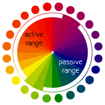
- The warmer colors are called the active range and the cooler colors are called the passive range.

- Vibrating Boundaries may occur when opposing colors are brought together.

- Monochromatic Relationship: Colors that are shade or tint variations of the same hue.

- Complementary Relationship: Those colors across from each other on a color wheel.

- Split-Complementary Relationship: One hue plus two others equally spaced from its complement.

- Double-Complementary Relationship: Two complementary color sets; the distance between selected complementary pairs will effect the overall contrast of the final composition.

- Analogous Relationship: Those colors located adjacent to each other on a color wheel.

- Triad Relationship: Three hues equally positioned on a color wheel.

The Meaning of Colors

Red: Energy, strength, passion, eroticism, cheerfulness, courage, element of fire, career goals, fast action, lust, desire, blood, vibrancy, driving forces, risk, fame, love, survival, war, revolution, danger, aggression, strength, power, determination

Pink: Romance, love, friendship, femininity, truth, passivity, good will, emotional healing, peace, calming, affection, emotional maturity, caring, nurturing, sweet tasting, sweet smelling, ethereal, delicacy.

Orange: warmth, energy, balance, enthusiasm, vibrancy, vitality, expansiveness, flamboyance, excitement, business goals, property deals, ambition, career, goals, general success, justice, legal matters, selling, action, attention-grabbing, the sun, friendly, inviting, intense, joy, strength

Blue: good fortune, communication, wisdom, protection, spiritual inspiration, calmness, reassurance, gentleness, fluidity, water, sea, creativity, peace, calming, higher thoughts, mystery, sky, formality, travel, devotion, progress, quiet wisdom, freedom.

Green: earth mother, physical healing, monetary success, abundance, fertility, tree & plant magic, growth, food, hope, personal goals, resurrection, renewal, youth, stability, endurance, freshness, nature, environment, tranquil, refreshing, quiet, hope, immortality, health, healing, good luck

Yellow: Sun, intelligence, light, accelerated learning, memory, logical imagination, social energy, cooperation, organization, breaking mental blocks, sunshine, joy, happiness, intellect, energy, cheerfulness, optimism, purity, enthusiasm, warmth, honor, loyalty, mental force, clarity, perception

Gold: wealth, god, winning, safety, masculine power, happiness, playful humor, prestige, wisdom, love of spirit, meaning, purpose, awe, spiritual love, quests of the heart, desire for power, mystic powers, higher mathematics, sciences, attainment, concentration

White: spirituality, goddess, peace, higher self, purity, virginity, reverence, simplicity, cleanliness, humility, precision, innocence, youth, birth, winter, snow, good, sterility, cold, clinical, sterility, clarity, perfection

Purple: influence, third eye, psychic ability, spiritual power, self assurance, hidden knowledge, dignity, high aspirations, royalty, spirituality, nobility, ceremony, mystery, transformation, wisdom, enlightenment, sophistication, cruelty, arrogance, intuition, dreams, unconscious, invisible, telepathy, empathy, imagination, deja vu, universal spirit, spiritual connection, deeper truth, nobility, wealth, extravagance

Thursday, October 2, 2008

Notes on Helvetica

Helvetica

Helvetica: Brand names, signs, logo

The name of the company and the logo of the company are just done in Helvetica.

Helvetica is simple, neutral, it is easy of the eye, it is sans serif, the letter has uniformity to them, and there is equal spacing.

Spacing is as and more important than the font itself. Helvetica has perfect spacing.

Helvetica is modernist font, which represents modernist ideas. However, it is sans serif it is easy on the eye.

The problem of Helvetica is that it is overused.

It is ubiquitous- it is everywhere.

Helvetica is considered ‘not cool’ because it is too simple, too perfect, and too boring because it is ubiquitous.

It is corporate and artists dislike it. It is institutional.

Modern is becoming retro.

Rather than being an authoritarian, oppressive, bureaucratese, instead accessible, transparent, and accountable.

Horizontal slicing of terminals - characteristic of Helvetica

Helvetica example: Jeep, Sears, BMW, Toyota, aprilia, target, Tupperware, Nestle, Verizon, conEdison, Lufthansa, Energizer, Oral B, The North face etc.

This shows again that Helvetica is ubiquitous

A real typeface needs rhythm and contrast. Helvetica doesn’t have rhythm or contrast.

Helvetica needs lots of space and all the letters shouldn’t look the same.

Typeface is a part of branding. Branding is the projecting of quality.

Creating a font

Use h first then o and then p. h n u because you have lots of information between them.

Then you start building on go to words.

Counter cultural movement of the 1960s is what overwhelms the modernist movement.

Modernism: (objectivist)

Functionalism

Utilitarianism

Clean and simple

Post Modernism: (subjectivist)

Freeform

Chaotic

Complicated

Michael C Place: new modernist. Has a view that the context can make the piece speak in a different way though the font is the same.

Thursday, September 25, 2008

Chapter 9: Categories of Type

There are mainly six groups to divide the font and they are:

  •        Old style
  •        Modern
  •        Slab serif
  •        Sans serif
  •        Script
  •        Decorative

Old style: old styles always have serifs. Also the old styles have something called stress. This is when the thickness of the line goes from thin to thick and you can see it in curved strokes. Some examples can be Goudy, Palatino, Times, Baskerville, and Garamond.

Modern: modern typefaces have serifs, but the serifs are now horizontal instead of slanted, and the serifs are very thin. Moderns tend to have a cold look and the stress is vertical. Some examples of modern fonts can be Bodoni, Times Bold, Onyx, Fenice, Ultra, and Walbaum.

Slab serif: many slab serifs have a thin/thick contrast and are readable easily. These fonts are used in children’s books because they look clean. Some examples are Clarendon, Memphis, Memphis Extra Bold, and New Century Schoolbook.

Sans serif: this font is fro creating eye-catching pages and there are no visible thin/thick transitions in the strokes. Some examples of sans serif are Antique Olive, Helvetica, Avant Garde, Formata, Folio, Franklin Gothic, Futura, Condensed, and Syntax.

Script: scripts can be good when they are large and some examples of script is Arid, Shelly Volante, Legacy, Cascade, Linescript, and Zapf Chancery

Decorative: these fonts are easy to indentify but their powerful use is limited. Some examples can be Party, Potrzebie, Improv, Pious Henry, Juniper, Juice, Fajita and Scarlett. 

Wednesday, September 24, 2008

Chapter 8: Type

A concordant relationship is when you use one type family throughout the whole page. This is in terms of style, size, and weight. This can look harmonized and formal but it could get boring for the reader as the reader keeps reading.

A conflicting relationship is when you combine similar typefaces. This can be distracting for the reader.

A contrasting relationship is when you combine different typefaces together. This can make the contrasts emphasized and also this can draw the reader’s attention easily.

Concord is a useful concept however a conflict should be avoided. 

Wednesday, September 17, 2008

Chapter Six: Review

- Don't be afraid of font changing, blank spaces etc.
Proximity: Separate the elements that are not related to each other. This helps the reader to understand your point quickly.
Alignment: To keep the page unified, align the elements.  
Contrast: Contrast can be used by lines, colors, spatial relationships, directions etc. Contrast is good because it attracts readers attention easily.


Tuesday, September 16, 2008

Chapter Five: Contrast

     Contrast must be strong and effective and it is to make the reader interested. If two ideas on one page are different you should make it completely different. You can make contraction with color, font and texture. Contrast is good because our human eyes like contrasting images. There are basically two purposes of putting contrast into a page. The first reason is organization and the second reason is to draw the reader’s attention. Not only there are font, color and texture but also there are shapes, sizes, space etc. You should avoid making a small difference between two different ideas. If you are going to use contrast, then make the two really different.

Thursday, September 11, 2008

What I need for a Company

- Logos

- Banners

- Stationary

- Cards

- Front desk Piece

- Notes

- Fax sheets

- Memos

Wednesday, September 10, 2008

Chapter Four: Repetition

      Repetition is when you repeat a design throughout the page to make the page look cohesive and unified. Some elements which you can repeat font, format, line, color and relationships etc. If you have bolded the heading then you could catch the reader’s attention more if you bold the other sub- headings.  Also for the font; even though you don’t make the size same, if you make the type of writing the same, it make the article cohesive. To summarize, repetition is used to make the writing cohesive and also to make the reader interested about it. In repetition, you have to beware of contrast because it might make the reader confused. They might not know what is the main point of the writing. 

Tuesday, September 9, 2008

Chapter Three: Alignment

      The third chapter is called alignment and it says that there shouldn’t be anything put on the page randomly without any reason. Also the page should be neat and tidy so the reader doesn’t get confused. It said in the book that people often just put the information in the center but it could be better to put it on either side. You can center the writing but try to be dramatic with the font and don’t use the same font throughout the whole page. Don’t try to spread things out but make it neat and tidy; to put things in order. You have to find strong line and use it. For example if the head lines are placed left, then all the other writings should be put on the left side because this shows strong alignment. When you are designing a page, you have to unify the information and organize it.

Thursday, September 4, 2008

Chapter Two: Proximity

     Chapter two talks about proximity and the author is trying to say that when you are writing a newspaper, ad or anything else, it should be organized so the readers can understand the intention of this ad or newspaper. Putting things which are similar together is good for the reader to know what the writing is about in one glance. When the items are not related to each other, then you can have more than one space in between the two to differentiate them. The font of the ad or the newspaper shouldn't always be the same. If the font is the same and the writing is normal, then no one can understand what the main topic is about and what the information is. So, bolding the text and writing in different font is also another way to draw the readers attention and make the reader comfortable when reading the text. In terms of space, the purpose of the writing is not to fill the page up by to transfer the information efficiently. So, it is important to organize the text and not to fill up the page with the text. There are somethings to avoid when writing an ad or newspaper. The things to avoid is to not put many different topics in one page and not to have too many gaps and make the reader confused. 

Chapter One

     Chapter one is basically introducing the four types of basic principles proximity, alignment, repetition and contrast. In the first chapter the author said that once you name something, you get to see the object you have named which you haven't noticed before. For example, he gave an example of the Joshua Tree.

Tuesday, September 2, 2008

What is Graphic Design? Why is it so Important?

1. How would you define graphic design or Design? When did it start?
Graphic design is methods used by people to visually represent ideas and messages to others efficiently. Or it could be making something which represents a company. For example, graphic designs include magazines, logos and advertisements. Graphic design is not only the product which is produced but also the process of designing.
2. How would you define Technology?
Technology is a field which deals with making our life’s easier by creating new products. Technology always has to fit the principle form follows function. This is because that is why technology is there to make things easier which means the product must fit the purpose.
3. What would you say is the relationship between Design and Technology?How have they evolved together over time? Are they one and the same?
The relationship between design and technology is that they are both needed for each other. For example to design better you have to have good technology so that it is more comfortable to design. Also technology has to be designed so that it fits the function. Technology and design are not the same but they are just a catalyst for each other.
4. How has your perception of design changed after reading those articles?
I didn’t know anything about design or technology but know I understood that technology and design are closely related and mostly in design form follows function is applied a lot.

Thursday, August 21, 2008

Form Follows Function

Form Follows Function

Form follows function is a principle in which the product is designed based only on the function and the purpose. This form follows function principle can have a negative affect in business. The acceptance of a designed product depends on the social expectations so if the principle is followed the product probably wouldn’t be sold. There was another principle other then form follows function called ornament is a crime. Ornaments are not non- functional in every single case but can be functional in some cases which include architecture. These two designs were moral principles to modernists and these principles made traditional design being replaced. The use of functions will decide how the anatomy will be structured.

A memory stick applies to the article because the design fits the function and purpose very well but also is not plain but has some kind of pattern and color to balance out between the function and the ornament. According to the article, as time passed form and function principle were not effective to the customers. The memory stick has a good mixture of ornament and function.