Tuesday, September 30, 2008

Weekly Article: Shape - Basic Elements of Design

What are Shapes in Design:
Shapes are a basic element of design. They are made up of closed contours and three dimensional objects placed in the design. Shapes are used to convey meaning and organize information. Shapes can be 2-dimensional or 3-dimensional.
There are three basic types of shapes:
· geometric shapes
· natural shapes
· abstract shapes
Use of Shapes in Design:
Shapes in Web design can be used in many ways:
· add interest to a design
· sustain interest
· organize or separate elements
· direct the eye through the design
Geometric Shapes:
Geometric shapes are what most people think of when they think of shapes. Most geometric shapes on Web pages are created through layout and CSS. Some common geometric shapes you see on Web pages are:
· squares and rectangles
· circles
· triangles
· diamonds
Natural Shapes:
Natural shapes are shapes that are found in nature, but they are also shapes of man-made items. Most natural shapes in Web pages are created with images. Some examples of natural shapes are:
· leaves
· puddles
Abstract Shapes:
Abstract shapes are those that have a recognizable form but are not "real" in the same way that natural shapes are. For example, a stick-figure drawing of a dog is an abstract dog shape, but another dog in a photo is a natural shape. Abstract shapes in Web designs are usually added through images. Some examples of abstract shapes are:
· alphabet glyphs
· icons
· symbols

Summary of shapes in design:
Shapes are used to organize information and express your ideas across efficiently. Shapes can be either 2 dimensional or 3 dimensional. There are many uses of shape in design and they can be things such as: gaining attention, organize elements as said and to direct the eye through design. Shapes can be mainly divided into three man categories: geometric shapes, natural shapes, and abstract shapes. Geometric shapes are shapes that we normally think of such as circles and triangles. Natural shapes are things that are found outside commonly such as leaves, stones etc. Last of all abstract shapes are elements such as icons, and symbols.

Source from: http://webdesign.about.com/od/webdesingbasics/p/aashape.htm

Friday, September 26, 2008

Weekly Article: Color Harmony

Using Color Wheels and Color Theory to Design Harmonious Pages

Once you understand the basics of color theory, you can start learning how to combine those colors into a harmonious whole. There are certain colors that look good together, while other colors look so painful you have to click away before they burn your eyes. And while you might recognize these combinations when you see them, there is a theory based on the color wheel as to which colors will look nicest together.

Analogous Colors

These are the colors that sit next to each other on the color wheel. For example: green, yellow-green, and yellow; or red, red-orange, and orange. Play with the hues and saturation of analogous colors to create a harmonious color scheme.

Complementary Colors

Complementary colors are those colors that are opposite one another on the color wheel. By using colors that are opposite one another, you create color schemes that have high contrast and so are brighter and more vivid. Some contrasting colors are: red and green or blue and orange.

Color Triads

By placing an equilateral triangle on the color wheel, you can create color schemes that have a lot of life to them. The most basic color triad is the three primary colors: red, yellow, and blue. But others are: green, purple and orange, or yellow-orange, blue-green, and red-purple.

Still Having Trouble?

When looking for color schemes the first place I start is nature. The color schemes found in nature are typically harmonious to our eyes. This can be the case even if the colors don't "go together" according to color theory.

Summary of Color Harmony

Color is very important when it comes to designing a page. If you can put the colors nicely so that it is comfortable for the reader, the page would look much more effective. Analogous colors are colors that sit next to each other on the color table. These colors are used to form a harmonious color design. Complementary colors are colors which are opposite one another on the color table. This gives contrasts and makes the page look brighter. You can also put colors in a different way. By placing an equilateral triangle in the color table, you will get three colors. Those colors could be used to design your page. Nature is a good color scheme to have.

Source from: http://webdesign.about.com/cs/color/a/aacolorharmony.htm

Examples of the 6 types of fonts

There were 6 types of fonts mentioned and they were:
  • Old style
Old style: old styles always have serifs. Also the old styles have something called stress. This is when the thickness of the line goes from thin to thick and you can see it in curved strokes. Some examples can be Goudy, Palatino, Times, Baskerville, and Garamond.

  • Modern
Modern: modern typefaces have serifs, but the serifs are now horizontal instead of slanted, and the serifs are very thin. Moderns tend to have a cold look and the stress is vertical. Some examples of modern fonts can be Bodoni, Times Bold, Onyx, Fenice, Ultra, and Walbaum.
  • Slab serif
Slab serif: many slab serifs have a thin/thick contrast and are readable easily. These fonts are used in children’s books because they look clean. Some examples are Clarendon, Memphis, Memphis Extra Bold, and New Century Schoolbook.

  • Sans serif
Sans serif: this font is fro creating eye-catching pages and there are no visible thin/thick transitions in the strokes. Some examples of sans serif are Antique Olive, Helvetica, Avant Garde, Formata, Folio, Franklin Gothic, Futura, Condensed, and Syntax.

  • Script
Script: scripts can be good when they are large and some examples of script is Arid, Shelly Volante, Legacy, Cascade, Linescript, and Zapf Chancery

  • Decorative
Decorative: these fonts are easy to indentify but their powerful use is limited. Some examples can be Party, Potrzebie, Improv, Pious Henry, Juniper, Juice, Fajita and Scarlett.

Thursday, September 25, 2008

Chapter 9: Categories of Type

There are mainly six groups to divide the font and they are:

  •        Old style
  •        Modern
  •        Slab serif
  •        Sans serif
  •        Script
  •        Decorative

Old style: old styles always have serifs. Also the old styles have something called stress. This is when the thickness of the line goes from thin to thick and you can see it in curved strokes. Some examples can be Goudy, Palatino, Times, Baskerville, and Garamond.

Modern: modern typefaces have serifs, but the serifs are now horizontal instead of slanted, and the serifs are very thin. Moderns tend to have a cold look and the stress is vertical. Some examples of modern fonts can be Bodoni, Times Bold, Onyx, Fenice, Ultra, and Walbaum.

Slab serif: many slab serifs have a thin/thick contrast and are readable easily. These fonts are used in children’s books because they look clean. Some examples are Clarendon, Memphis, Memphis Extra Bold, and New Century Schoolbook.

Sans serif: this font is fro creating eye-catching pages and there are no visible thin/thick transitions in the strokes. Some examples of sans serif are Antique Olive, Helvetica, Avant Garde, Formata, Folio, Franklin Gothic, Futura, Condensed, and Syntax.

Script: scripts can be good when they are large and some examples of script is Arid, Shelly Volante, Legacy, Cascade, Linescript, and Zapf Chancery

Decorative: these fonts are easy to indentify but their powerful use is limited. Some examples can be Party, Potrzebie, Improv, Pious Henry, Juniper, Juice, Fajita and Scarlett. 

Wednesday, September 24, 2008

Chapter 8: Type

A concordant relationship is when you use one type family throughout the whole page. This is in terms of style, size, and weight. This can look harmonized and formal but it could get boring for the reader as the reader keeps reading.

A conflicting relationship is when you combine similar typefaces. This can be distracting for the reader.

A contrasting relationship is when you combine different typefaces together. This can make the contrasts emphasized and also this can draw the reader’s attention easily.

Concord is a useful concept however a conflict should be avoided. 

Wednesday, September 17, 2008

Poster changed after Review


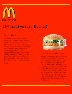
I changed the font color because it shows contrast. This makes the writing more legible and also I took the dollar picture off because it didn't show alignment and it was just in the way. Though I only have one picture This looks more aligned and unified.

Chapter Six: Review

- Don't be afraid of font changing, blank spaces etc.
Proximity: Separate the elements that are not related to each other. This helps the reader to understand your point quickly.
Alignment: To keep the page unified, align the elements.  
Contrast: Contrast can be used by lines, colors, spatial relationships, directions etc. Contrast is good because it attracts readers attention easily.


Tuesday, September 16, 2008

Weekly Article: What is Emphasis in Design

What is Emphasis in Design:

Emphasis in design provides the focal point for the piece. It is a way of making the element that is most important stand out in the design. Emphasis is sometimes called dominance.

Use of Emphasis in Design:

One of the biggest mistakes designers can make is trying to make everything in the design stand out. When everything has equal emphasis at best it can make the piece appear busy, and at worst the design will be boring and unappealing.
Instead, focus on creating a visual hierarchy in your designs. If you've worked to create a semantic flow to your HTML markup, that will be easier. Because your Web page will already have a hierarchy, all your design needs to do is put the emphasis on the correct elements - such as the H1 element for the most emphasis and so on.

How to Include Emphasis in Web Designs:

Emphasis in Web design can be implemented in many ways:
· Using semantic markup will provide some emphasis, even without any styles.
· Change the size of fonts or images to emphasize or de-emphasize them in the design.
· Using contrasting colors can provide emphasis.

Summary of this article:

Emphasis is when you make some element on your page stand out. This is to show that the element which stands out is the key point of this page. Emphasis can be also called dominance. Emphasis is used in design because the page would be very boring and not attracting if there isn’t any change through out the page. Emphasis can be used by color, and size of fonts or images etc.

Source from: http://webdesign.about.com/od/webdesignbasics/p/aaemphasis.htm

Poster changed after Contrast


I have changed the background color so it is contrasting with the rest of the information and the picture (especially the logo). So I changed the color which is one element to use contrast in a webpage. This made the poster a bit more bright, it made the poster look a bit more interesting. I think this looks not boring compared to the white background poster.

Chapter Five: Contrast

     Contrast must be strong and effective and it is to make the reader interested. If two ideas on one page are different you should make it completely different. You can make contraction with color, font and texture. Contrast is good because our human eyes like contrasting images. There are basically two purposes of putting contrast into a page. The first reason is organization and the second reason is to draw the reader’s attention. Not only there are font, color and texture but also there are shapes, sizes, space etc. You should avoid making a small difference between two different ideas. If you are going to use contrast, then make the two really different.

Thursday, September 11, 2008

Weekly Article: What is Balance in Design

What is Balance in Design:
Balance in design is the distribution of elements across the design. Balance is a visual interpretation of gravity in the design. Large, dense elements appear to be heavier while smaller elements appear to be lighter. You can balance designs in three ways:
· symmetrical balance
· asymmetrical balance
· discordant or off-balance
Use of Balance in Design: Balance in Web design is found in the layout. The position of elements on the page determines how balanced the page appears. One big challenge with achieving visual balance in Web design is the fold. You may design a layout that is perfectly balanced in the initial view, but when the reader scrolls the page, it can come out of balance.
How to Include Balance in Web Designs: The most common way to incorporate balance into Web designs is in the layout. But you can also use the float style property to position elements and balance them across the page. A very common way to balance a layout symmetrically is to center the text or other elements on the page. Most Web pages are built on a grid system, and this creates a form of balance for the page right away. Customers can see the grid, even if there aren't any visible lines. And Web pages are well suited to grid designs because of the square nature of Web shapes.
Symmetrical Balance: Symmetrical balance is achieved by placing elements in a very even fashion in the design. If you have a large, heavy element on the right side, you'll have a matching heavy element on the left. Centering is the easiest way to get a symmetrically balanced page. But be careful, as it can be difficult to create a centered design that doesn't look flat or boring. If you want a symmetrically balanced design, it's better to create the balance with different elements - such as an image on the left and a large block of heavier text to the right of it.
Asymmetrical Balance: Asymmetrically balanced pages can be more challenging to design - as they don't have elements matched across the centerline of the design. For example, you might have a large element placed very close to the centerline of the design. To balance it asymmetrically, you might have a small element farther away from the centerline. If you think of your design as being on a teeter-totter or seesaw, a lighter element can balance a heavier one by being further away from the center of gravity. You can also use color or texture to balance an asymmetrical design.
Discordant or Off-Balance: Sometimes the purpose of the design makes an off-balance or discordant design work well. Designs that are off-balance suggest motion and action. They make people uncomfortable or uneasy. If the content of your design is also intended to be uncomfortable or make people think, a discordantly balanced design can work well.

Summary of this article:
One of the basic principles in designing is balance. Balance in design means to distribute the information so that it is comfortable for the reader to read and it is visually affecting the reader. Layout is the common way in which you balance a web page. There are three types in balance and they are symmetrical balance, asymmetrical balance and discordant or off- balance. First of all, symmetrical balance means when you put a small image on one side, you should put a text which doesn’t have much information in on the other side to equally balance both sides out. Also the information can be in the center but it could be boring so you have to be careful about that. This is the commonly used one. Asymmetrical balance is when if you put a big looking picture on one side close to the edge, you should put a small text right next to the center line on the other side. You can also use color to balance an asymmetrical design. The last one is off-balance and it is to make the page off-balanced on purpose to make the reader uncomfortable reading it. When you are trying to write something which is uncomfortable then off-balance is good for that.

Source from: http://webdesign.about.com/od/webdesignbasics/p/aabalance.htm

What I need for a Company

- Logos

- Banners

- Stationary

- Cards

- Front desk Piece

- Notes

- Fax sheets

- Memos

Poster changed after Repetition

The poster changed a lot after reading the chapter on repetition in terms of font of main text, font of headings, and lines. Before reading the chapter, the two text boxes had a different font. But after reading it, I have made the two the same to make it unified. Also I changed the font of the headings so that it is different to the text. I did this to make the headings look clear. I made the size of the font same for the information and I made the main heading the biggest and the sub-headings the same. Also I put two lines in yellow so it matches with the McDonald logo.

Wednesday, September 10, 2008

Chapter Four: Repetition

      Repetition is when you repeat a design throughout the page to make the page look cohesive and unified. Some elements which you can repeat font, format, line, color and relationships etc. If you have bolded the heading then you could catch the reader’s attention more if you bold the other sub- headings.  Also for the font; even though you don’t make the size same, if you make the type of writing the same, it make the article cohesive. To summarize, repetition is used to make the writing cohesive and also to make the reader interested about it. In repetition, you have to beware of contrast because it might make the reader confused. They might not know what is the main point of the writing. 

Poster changed after Alignment


After reading the article on alignment, I have changed the size of the picture of the burger because the burger is not the main picture but the McDonald logo is the main picture because McDonald is advertising this event. Also I have increased the size of the logo to emphasize that this is the main picture. I have read the alignment article and changed the poster so that the picture and the text is in line with each other so it looks very organized. Also with the text, first I had both of them centered which made it look untidy and boring so I pushed the text to the left side so it looks tidier. Also since all the information are aligned on the left side, I moved the heading to the left side so it looks more organized.

Tuesday, September 9, 2008

Chapter Three: Alignment

      The third chapter is called alignment and it says that there shouldn’t be anything put on the page randomly without any reason. Also the page should be neat and tidy so the reader doesn’t get confused. It said in the book that people often just put the information in the center but it could be better to put it on either side. You can center the writing but try to be dramatic with the font and don’t use the same font throughout the whole page. Don’t try to spread things out but make it neat and tidy; to put things in order. You have to find strong line and use it. For example if the head lines are placed left, then all the other writings should be put on the left side because this shows strong alignment. When you are designing a page, you have to unify the information and organize it.

Thursday, September 4, 2008

Poster changed after Proximity


In this picture I changed the location of the images and the writings to make it look easier to understand. I put the one dollar with the one dollar event together because they relate to each other. Also I tied the plus one and the burger image together because it is closely related to the writing which is beneath it. On the original poster I tried to fill up all the space there is but now making the related topics tied up looks more simpler. I also put the logo on the top to represent from where this ad is from. In the original poster the logo was on the bottom which is not so good. I changed the 28 picture to a writing saying 28th anniversary events because the readers might not know what the 28 means.

Chapter Two: Proximity

     Chapter two talks about proximity and the author is trying to say that when you are writing a newspaper, ad or anything else, it should be organized so the readers can understand the intention of this ad or newspaper. Putting things which are similar together is good for the reader to know what the writing is about in one glance. When the items are not related to each other, then you can have more than one space in between the two to differentiate them. The font of the ad or the newspaper shouldn't always be the same. If the font is the same and the writing is normal, then no one can understand what the main topic is about and what the information is. So, bolding the text and writing in different font is also another way to draw the readers attention and make the reader comfortable when reading the text. In terms of space, the purpose of the writing is not to fill the page up by to transfer the information efficiently. So, it is important to organize the text and not to fill up the page with the text. There are somethings to avoid when writing an ad or newspaper. The things to avoid is to not put many different topics in one page and not to have too many gaps and make the reader confused. 

Chapter One

     Chapter one is basically introducing the four types of basic principles proximity, alignment, repetition and contrast. In the first chapter the author said that once you name something, you get to see the object you have named which you haven't noticed before. For example, he gave an example of the Joshua Tree.

Wednesday, September 3, 2008

Tuesday, September 2, 2008

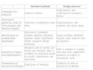
What is Graphic Design? Why is it so Important?

1. How would you define graphic design or Design? When did it start?
Graphic design is methods used by people to visually represent ideas and messages to others efficiently. Or it could be making something which represents a company. For example, graphic designs include magazines, logos and advertisements. Graphic design is not only the product which is produced but also the process of designing.
2. How would you define Technology?
Technology is a field which deals with making our life’s easier by creating new products. Technology always has to fit the principle form follows function. This is because that is why technology is there to make things easier which means the product must fit the purpose.
3. What would you say is the relationship between Design and Technology?How have they evolved together over time? Are they one and the same?
The relationship between design and technology is that they are both needed for each other. For example to design better you have to have good technology so that it is more comfortable to design. Also technology has to be designed so that it fits the function. Technology and design are not the same but they are just a catalyst for each other.
4. How has your perception of design changed after reading those articles?
I didn’t know anything about design or technology but know I understood that technology and design are closely related and mostly in design form follows function is applied a lot.